
JMG - Sociedade de Advogados is an advocacy consulting firm that deals with several fields from Law: from litigation and arbitration to social responsability. As a company formed by young entrepreneurs, they wanted to reflect contemporary values that are not common among their competitors: ties with the Academia (research and publications), personal and humanized attendance, flexibility and globalized references.
The briefing demanded a harsh rupture with the traditional visual language of the Law field: so, instead of serif-based logotypes with neutral colors and low contrast, it was proposed something brighter (yet delicate) to distinguish JMG among their competitors. It was also valorized not only non-serif types, but also italics to dynamize the brand's language.
Lastly the concept that ties this graphic language altogether is the idea of reflection: to reflect their own values in a field that needs some refresh.

Animated gif that represents the brand's concept.
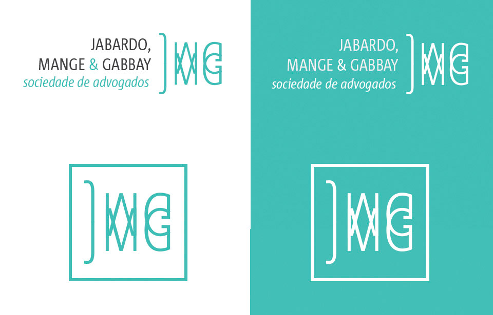
Above, logotype with symbol and signature; below, the reduced version of the brand.
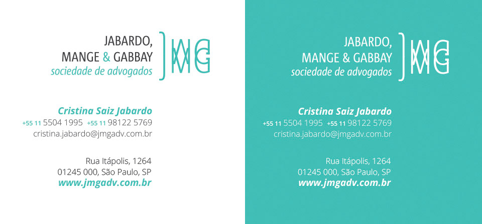
Complete brand with logotype, symbol and signatures - personal and institutional information.
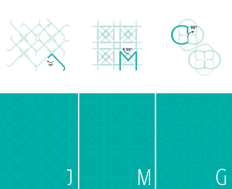
Texture design process. Each founder had her respective letter to form an unique pattern.
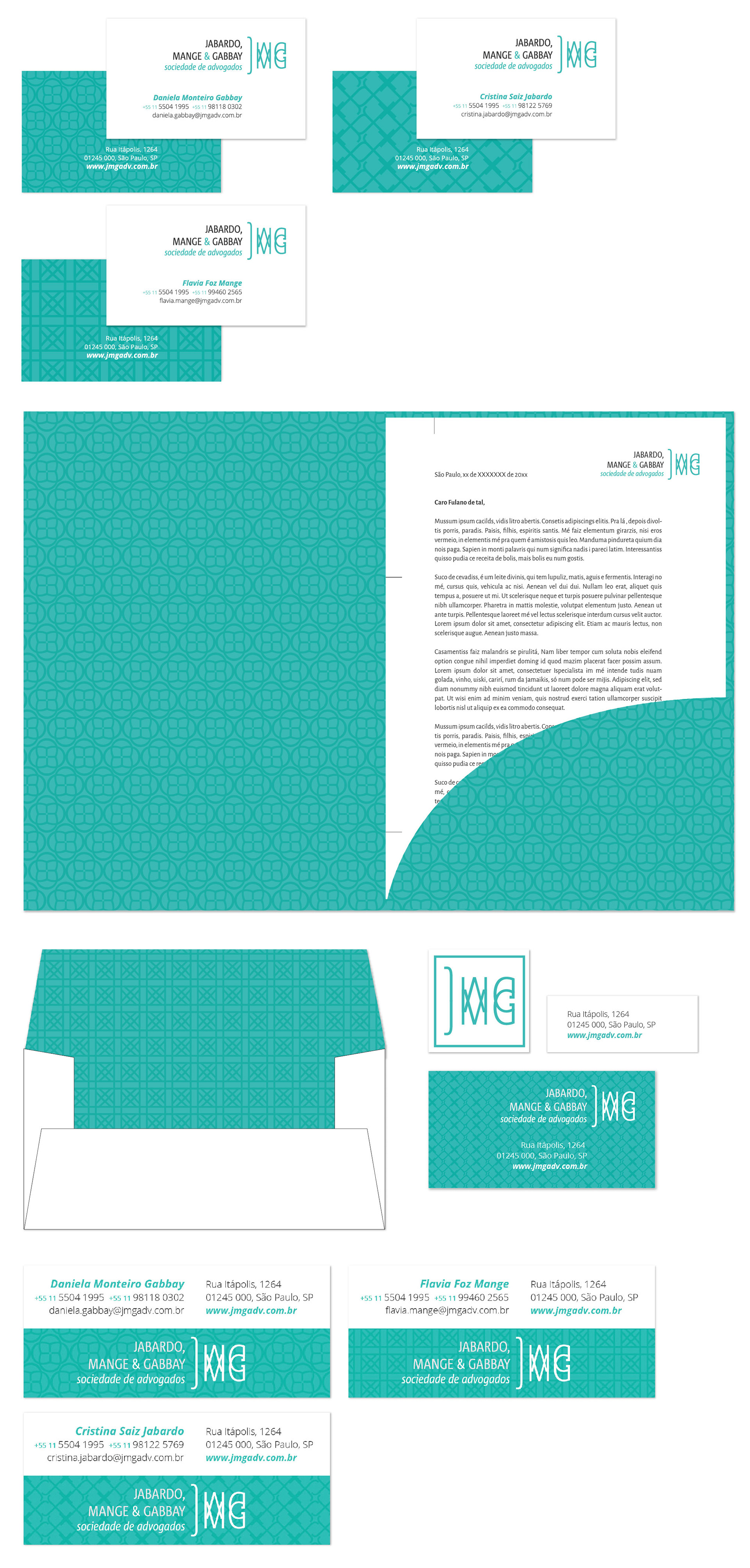
From above: business card (one background pattern per founder), folder with letterhead, envelope, stickers and digital signature for emails. Some material such as slide presentations and letterhead models were adapted to te client's software (Word and PowerPoint).
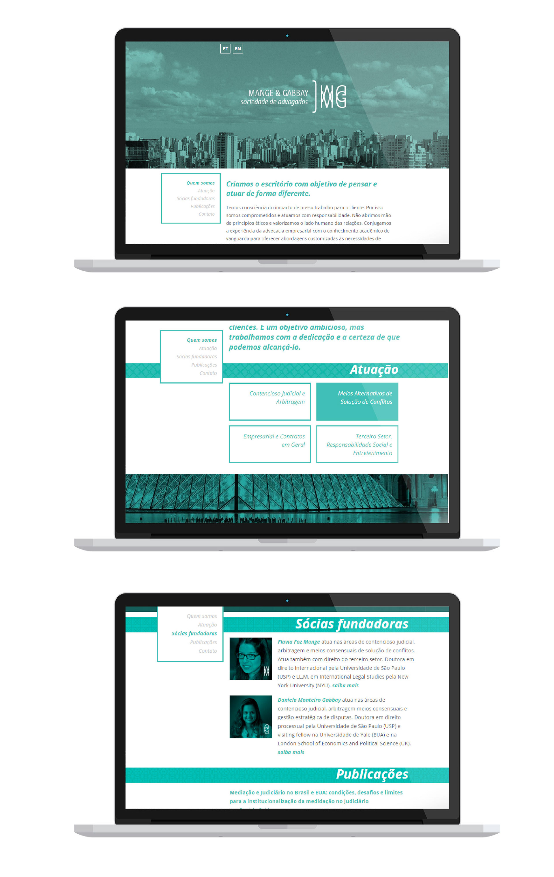
Website interface.